It’s bold and unavoidable. It’s at your tube station, it’s there while you’re driving along the motorway and it catches you as you rush to work on a grey morning. Oversized OOH is everywhere…
Billboards, by their very nature, are designed to engage us while we aren’t even trying to look. But in an overcrowded market, battling with depleting attention spans and limited physical space (although that part won’t be a problem if Elon Musk and Astrolab actually manage to get ads on the moon), it can be hard to stand out.
So for many brands looking to compete in this space, there’s only one thing for it – go big, or go home.
From the McDonald’s billboards that we’re lovin’, to Dulux Heritage’s high-brow literary efforts and the interactive pilot billboards from easyJet – here are seven bold and brilliant OOH creatives from 2024 so far.
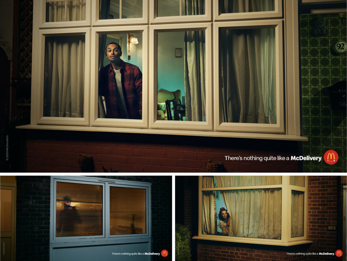
‘McDelivery Anticipation’ by the window
Our first billboard is a simple idea, beautifully designed. Tapping in to that moment when consumers are hungry and waiting to settle down and tuck in to their McDelivery, this ad showcases anticipation at its best – and simplest.
The creative itself shows nothing more complicated than people peering through their window hoping to spot the delivery driver zooming down the road.
Designed by Leo Burnett, with beautifully shot photography by William Green, it effectively builds on the food giant’s ‘There’s Nothing Like A Delivery Platform’. Indeed, whether you’re partial to lovin’ a McDonald’s or not, it’s hard not to find yourself enticed by the very human sense of anticipation on display.
Plus it isn’t the first time McDonald’s has grabbed our attention this year. The fast food giant recently showed its OOH prowess with this cheeky billboard which spilled over to eek every inch of value out of the nearby wall.
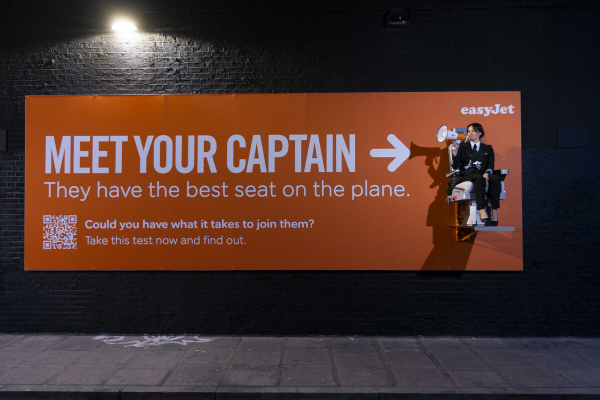
easyJet recruitment takes off with talking pilots
easyJet really went to town for its most recent spot, which formed part of its recruitment drive for more female pilots.
The bright orange interactive advert featured a real-life pilot strapped to the billboard. Captain Sarah Ackerley spent time sitting in the seat with a megaphone answering the public’s questions and busting myths about the profession.
The clever stunt – which was designed as part of a huge recruitment drive – got people talking and made headline news across the UK.
Backed up by online tests which allow people to find out whether they have the reaction speed and sense of direction needed to head up a commercial flight, the interactive campaign is a masterclass in how to make a recruitment campaign engaging.
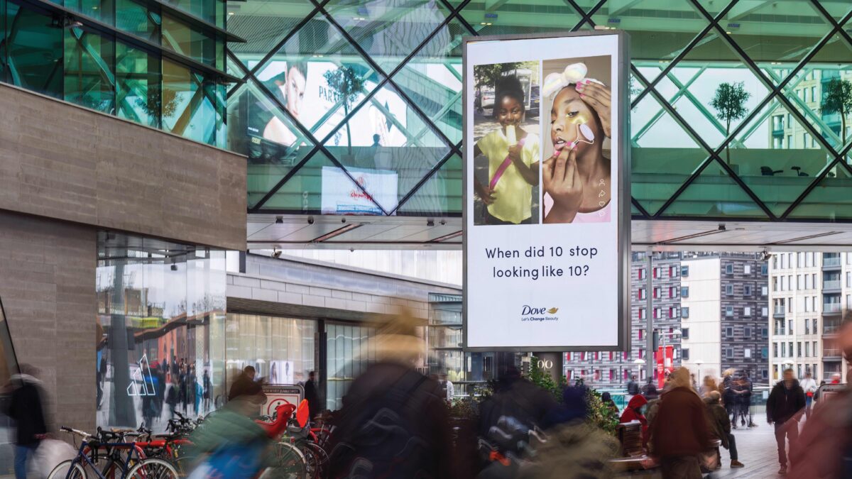
Dove’s 10v10 billboards by Ogilvy
As part of its #TheFaceof10 campaign highlighting the impact of young girls using skincare products intended for adults, Dove has created a series of striking OOH assets that contrast the age of young girls with their elaborate skincare routines.
The visuals – entitled ’10 v 10′ – show the girls engaged in activities like playing or eating ice cream, side by side with them carrying out grown-up skincare routines.
The thought-provoking spot highlights the impact of pressure and social media on young girls, and helps to cement Dove’s purpose-driven self-esteem messaging.
Subscribe to Marketing Beat for free
Sign up here to get the latest broadcast advertising news sent straight to your inbox each morning
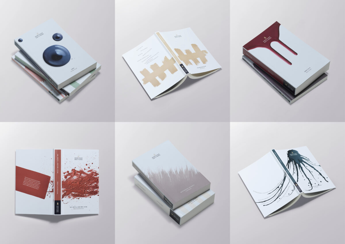
Dulux taps into classics
Yet another OOH from Ogilvy caught our eye, this one for Dulux Heritage Paint. It saw a range of literary classics including Moby Dick, Dracula, War of the Worlds and 1984 analysed for their emotional content before being matched with hues that evoked similar emotions.
Ogilvy and Dulux then created a set of bespoke editions, with spines acting as swatches, highlighting the power of colour and the feelings paint can create. Accompanying billboards showed the new designs alongside the slogan “Let the feelings of your favourite book become the colour of your favourite room”.
Dulux does a winning job here of reminding fans that it’s as classic as the literary greats.
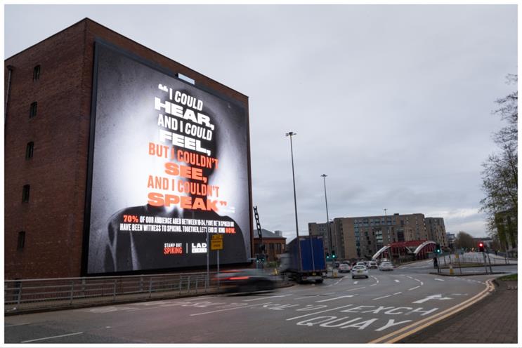
‘End Spiking Now’, Ladbible x Stamp out Spiking
Ladbible and Stamp Out Spiking joined forces to create a powerful campaign designed to push Downing Street into making spiking a specific offense and ultimately stop instances of the crime.
Alongside a social media campaign which uses Ladbible’s significant online platform to share survivor stories, they created an engaging billboard with the words “I could hear and I could feel, but I couldn’t see and I couldn’t speak”.
This sat alongside the hard-hitting stat that 70% of 18-24 year olds surveyed had been spiked or been witness to someone being spiked.
If there’s a message that deserves a billboard, it’s this one.
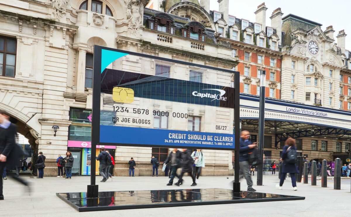
See-through credit card from Capital One
How better to display financial transparency than with a see-through credit card in billboard form?
That was the tongue-in-cheek OOH stunt from Capital One UK, created by Rise at Seven and built by Kinetic, which appeared at London’s Victoria station.
More than just a stylish transparent credit card, it comes as part of the brand’s credit made clearer campaign, to ensure that people are aware about the increased cost of borrowing. The message couldn’t be clearer.
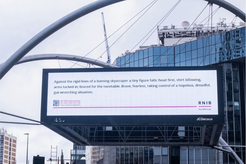
RNIB’s image-free billboard showcases alt text
OOH is widely considered a very visual output, but the RNIB (Royal National Institute for the Blind) used the format to highlight the importance of alt text for helping people with sight loss engage with images that would otherwise be inaccessible to them.
Developed with MullenLowe, the campaign spotlights the power of alt text with a billboard reading: “Against the rigid lines of a burning skyscraper a tiny figure falls: head first, shirt billowing, arms tucked in; braced for the inevitable. Brave, fearless, taking control of a hopeless situation”.
That description alone highlights the RNIB’s message, showing how alt text can be used for impactful storytelling.