Companies often re-brand their logos in a bid to refresh and modernise their brand image and make sure they continue to appeal to their target consumer.
But why do some brands – such as FMCG giants Hula Hoops and Baskin Robbins – amend their brand logos in extremely minute ways?
Marketing Beat, along with branding and design expert Trudie Avery, takes a look at the subtle brand logo changes over the years as well the tiny details in some well-known logos that even the keenest of eyes may have missed.
Hula Hoops
Earlier this year, one Reddit user noticed that crisp brand Hula Hoops had changed its packaging and logo design.
The user posted a photograph of a new crisp packet alongside a slightly older one, which shows that the rebrand has changed the classic red packet to brown, with a refreshed font and imagery.
“For the big guys it’s about keeping that edge, being current and keeping their customers thinking that they are not an archaic dinosaur,” said Avery.
“They have to keep up-to-date with what their customers want from them.”
What madness is this? The new redesign of "Classic" Hula Hoops is now brown!
byu/arithmetic inCasualUK
READ MORE: Top 10 most complained-about TV ads in the UK
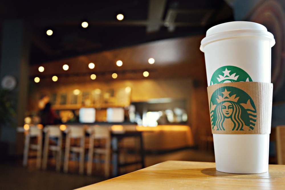
Starbucks
In 2011, coffee chain Starbucks decided to alter its logo. It did this by removing the text surrounding it, enlarging the mermaid-type image and losing the two stars either side of the circular emblem.
“The best and most memorable logos are those that adhere to simplicity,” ” Avery said.
“Simplifying a brand icon helps with functionality. Brands must keep up-to-date with the customers they are trying to appeal to and ensure they are extracting a good feeling from them.”
One Twitter user posted a picture of four Starbucks logos, highlighting how the emblems have been streamlined throughout recent decades.
The twitter account posted: “Fun fact: Starbucks logo change over the years”.
If you look closely at the 1971 cup, viewers can spot the NSFW version of the brand’s design. You can tell why that one did not last!
Fun fact: Starbucks logo change over the years #Micanvas13 pic.twitter.com/OPZxQuNWWW
— Jigeesha (@JigeeshaN) November 15, 2013
Tropicana
It may have been ten years ago but this logo rebranding and packaging redesign is too good not to share.
In 2009, the PepsiCo-owned juice brand Tropicana decided to completely alter its logo and packaging, with most of the public declaring the new look utterly unrecognisable. The design move was widely received as a complete marketing failure.
The Tropicana logo itself was fully redesigned and placed vertically along the carton. To add to the confusion, a glass of orange juice was also superimposed over most of the packaging, making the carton to look more like a supermarket own-brand juice, rather than a well-known global brand.
Sometimes refreshing brand design can go too far and lose customer’s interests and loyalty.
Avery stressed the importance of branding and logos on customer engagement.
“I always think of a logo as being the linchpin of the brand, the anchor point that every feeling and association comes from. There is so much psychology embedded in logos to give customers that positive feeling companies are looking for.”
On Twitter, one user shared a before and after photo of the redesign, saying: “Today on #BrandsGoneWrong: Tropicana’s packaging redesign. Once a product isn’t recognisable on store shelves, it is destined to fail.”
Mouldy marketing … Tropicana was right to bin that one.
Today on #BrandsGoneWrong: Tropicana’s packaging redesign. Once a product isn't recognizable on store shelves, it is destined to fail. pic.twitter.com/vOftD2U1YQ
— Idea Agency (@ideaagencybiz) November 16, 2016
LG – Life’s Good
Electronics corporation LG, has a logo that conceals a hidden aspect some people may have missed.
At first sight, consumers are able to identify a face winking back at them, but there is also something else about the logo that is hiding in plain sight.
Upon closer examination the nose can be seen as an L, while the outline of the face and wink is a G.
Avery added: “Companies use tiny little nuance effects with the shapes they choose to include to keep customers hooked. Psychology plays a massive part in designing a logo. Most people never even notice these small details, but when they do it changes the way they see that brand forever.”
![]()
Aldi, Asda, Morrisons and Co-op
Millions of people visit their local supermarkets to buy groceries every day, often nipping in and out and overlooking brand logos they feel so familiar with – with many of them changing over the years.
One TikTok user (@capipadart) highlighted the small and subtle changes Aldi, Asda, Morrisons and Co-op have made to their logos.
Aldi has opted for a slightly more 3D look, while Morrisons has stripped the black from its logo and added a yellow flower. Co-op shortened its original name The Co-operative and converted to a square logo, but Asda has merely changed its colour to a lighter green.
“Choosing the right colour is so important. Green is often seen as a very healthy colour. Perhaps Asda wanted to create a feeling of freshness with their colour change,” Avery added.
READ MORE: Aldi unveils Paralympic GB as new official partner
Baskin-Robbins
Earlier this month the international ice cream chain, Baskin Robbins, rebranded its logo as well as its packaging, employee uniforms and tagline, asking customers to ‘Seize the Yay’.
Alongside the launch of the rebrand the company also released a collection of limited-edition merchandise for the first time in its 77-year history.
The ice cream brand chose to lose the circular emblem look and modernise the font of the BR. It also opted to ditch the blue and bring in the brown.
“Our new look and manifesto recognise the extraordinary role ice cream has played in our customers’ lives, along with our continued commitment to innovation and creating someone’s next favourite flavour,” said Baskin-Robbins vice president of marketing and culinary, Jerid Grandinetti.
Baskin Robbins changed its logo today … What are we thinking? pic.twitter.com/kOZK3QPet2
— Evan (@StockMKTNewz) April 11, 2022
Toblerone
Duty-free favourite Toblerone has a hidden detail in its well-known gold mountain logo. If you look close enough at the Swiss chocolate emblem, its clear to see a bear, strolling around on two feet!
We may have just changed the way you look at this chocolate bar forever.
“Customers will never be able to unsee these hidden images once they have seen them. In some kind of unconscious subliminal way, those messages will always remain in the brain,” Avery added.

Click here to sign up to Marketing Beat’s free daily email newsletter