Virgin wines has teamed up with Borne in order to create a full scale rebrand of twenty-year old business Virgin Wines.
It follows on from a survey carried out by the brand revealed low brand association with buying expertise and premium, which led the brand to focus on promoting the quality and skill of its buyers in contrast with a wider subscription industry that relies heavily on offers.
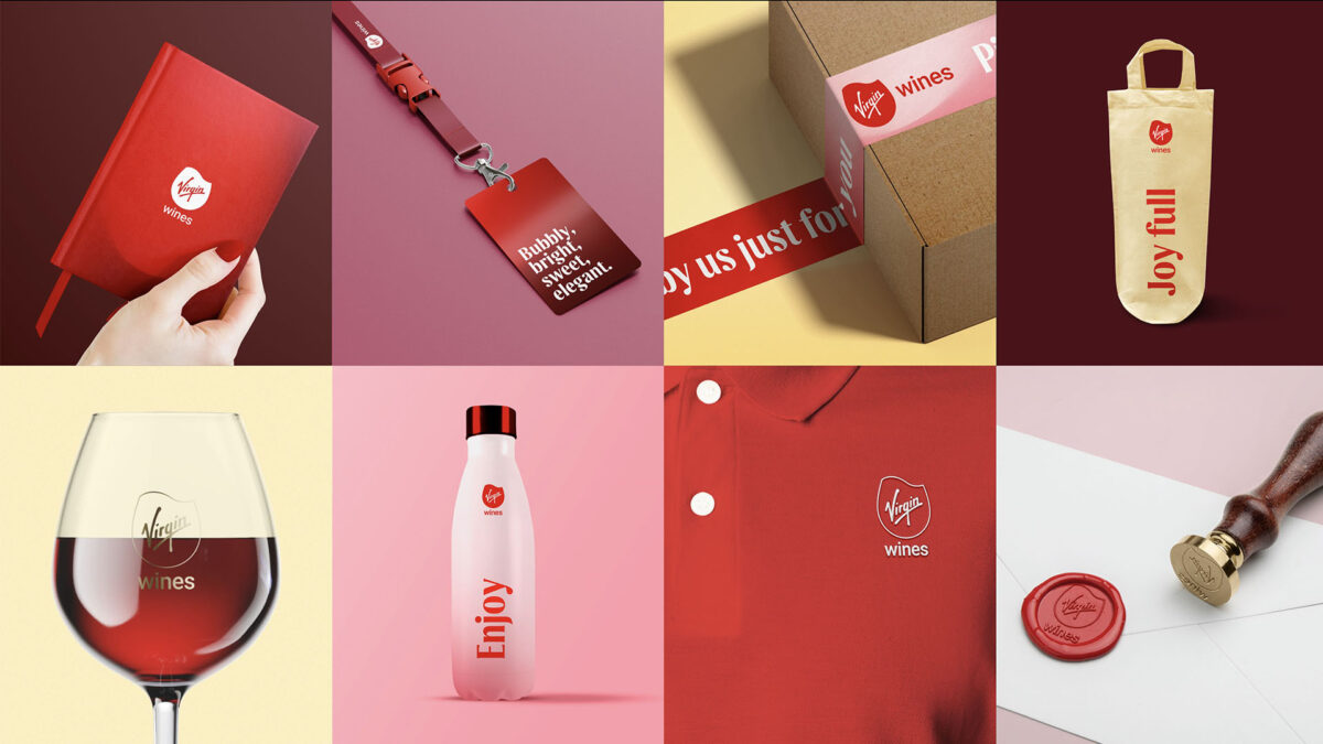
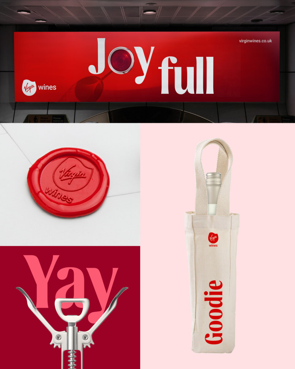
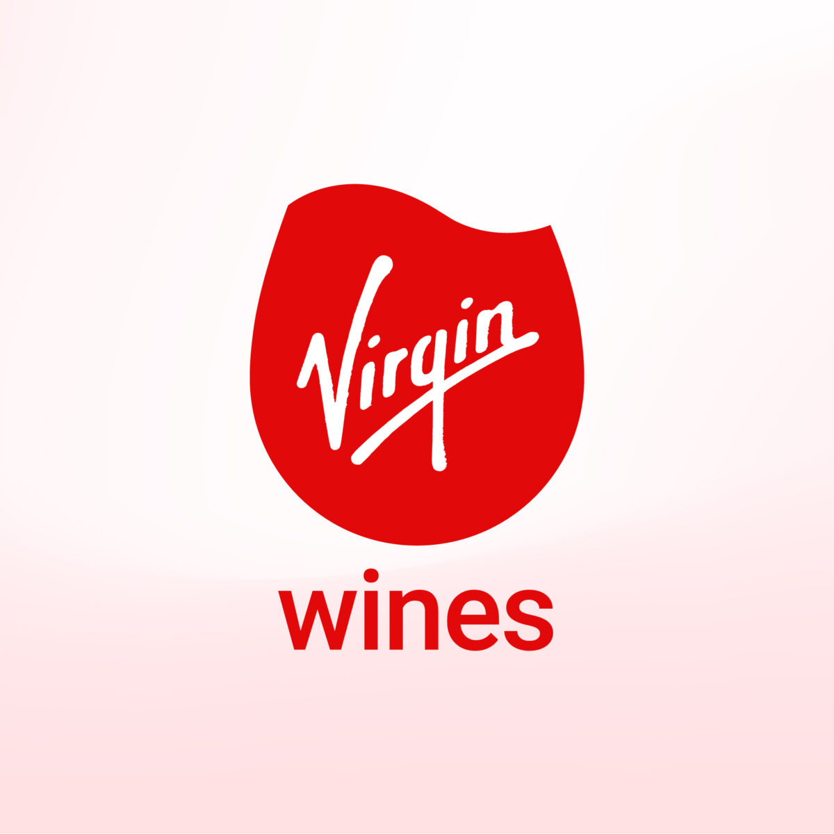
The rebrand centres around the idea of joy “from grape to glass”, and includes changes such as a change in logo design from a table wine’s glass mark to a swirl of wine in the glass before your first sip.
This all done in the form of a simple, adaptable mark that included a low-ink version to reduce its eco impact.
Subscribe to Marketing Beat for free
Sign up here to get the latest broadcast advertising news sent straight to your inbox each morning
In addition, the new design is free of handwritten texts and low legibility sans serif fonts are replaced with a Dalton Maag font with flowing lines and references to drops of liquid.
“Borne were a fantastic partner to work with in delivering what has been a transformational initiative for Virgin Wines,” said brand and digital marketing director Nathan Wadlow.
He continued: “They fully immersed themselves in the business from a very early stage – our culture, market positioning, product strategy, and more – which enabled them to grasp a deep understanding of the project at hand, including the nuances of what we were trying to achieve, and why, and the required strategy to meet our objectives.”
He added that Borne has “delivered an identity that perfectly represents our brand vision, and we couldn’t be happier with the creative vibrancy and clarity we now have.”
“I have no doubts that the elevated brand will deliver on our long-term objectives and be central to the ongoing success of Virgin Wines. Oh, and we had a lot of fun, too!”.