Marie Curie has unveiled an updated brand world to align with its new five-year strategy, alongside a fresh campaign raising awareness of its work supporting people’s end-of-life care. 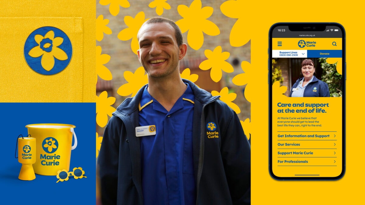
Developed in partnership with TBWA\London, the new inclusive visual identity modernises every aspect of the brand – from uniforms and fundraising materials to shopfronts, communications and its online presence.
At the centre of this brand rejuvenation, the iconic daffodil emblem has also been reimagined with a modern and accessible aesthetic that is hoped to be applied across the charity and its partnerships.
Among other changes, the charity has dramatically reduced the colour palette to deliver a more ‘ownable’ brand aesthetic.
Yellow is designed to signal the brighter future offered by Marie Curie, whilst blue nods to its 75-year heritage and long-standing link with the NHS.
Supporting this brand refresh, a 60-second TV spot from CPB London will run across ITV, Channel 4 and Sky network.
Subscribe to Marketing Beat for free
Sign up here to get the latest marketing news sent straight to your inbox each morning
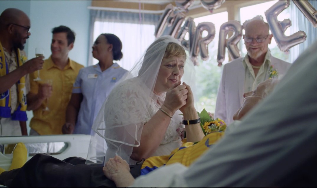
Showcased activity across TV, digital, radio and offline channels, the film is set to a moving soundtrack from The Paper Kites featuring Rosie Carney.
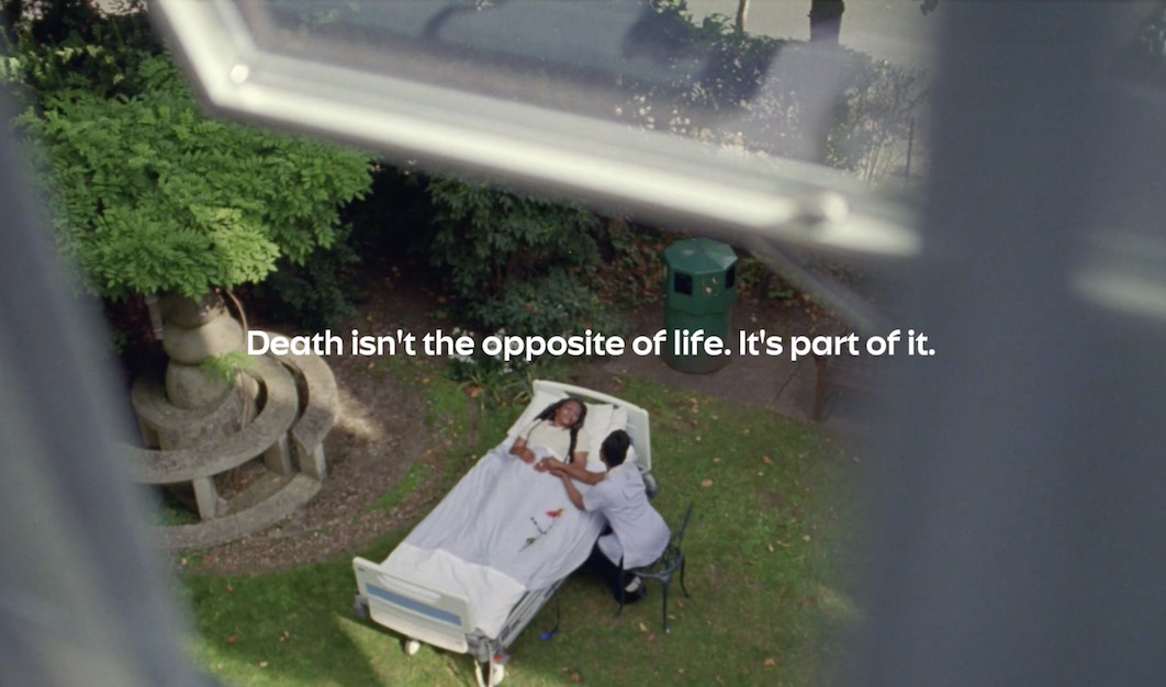
The TV spot tells real stories of loved ones and their families thinking about and curating their end-of-life care with the Marie Curie team.
Designed to reframe the way the viewers see end-of-life support, the film is punctuated by observational humour that looks at death in an honest and real way – encouraging the viewer to do the same.
The film concludes with the poignant endline, ‘Death isn’t the opposite of life. It’s part of it”.
“The charity has launched a new strategy that aims to double the number of people it provides direct expert end-of-life care to by the end of 2028,” says Marie Curie chief innovation, income and engagement officer, Maria Novell.
“This new creative and updated brand will help us engage people around this important issue with urgency but also warmth, grace and authenticity so that people really understand what Marie Curie does and how we can be there for those who need us.”
TBWA\London head of design Aaron Moss added: “The spirit of Marie Curie’s is about accessibility and inclusivity, and if we were going to take this amazing brand and make it fit for purpose in the modern world, we knew this needed to be our guiding principle.”
“By simplifying, modernising and energising the brand world, Marie Curie can show up in a more modern and accessible way that speaks to both the end of life care, but also a brighter and more equitable future.”
CPB London chief creative officer, Dean Wei added: “We see such an opportunity to reframe end-of-life care in the UK, and that’s reflected in how we approached the film.”
“Observed and intimate in style, we tried to be emotionally honest and direct. By creating a beautiful film, we hope this connects with people in a way that so much end-of-life messaging can’t.”