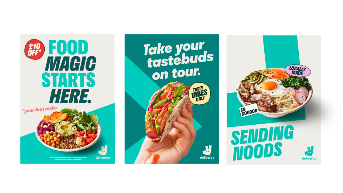
Deliveroo has unveiled a new evolved brand identity to drive a greater distinction and creative consistency across its global markets.
Developed by the food delivery firm’s in-house creative agency, Deliveroo Creative, the launch follows a decade of growth for the business and a subsequent need to maintain a competitive edge globally.
The team started by finding out what customers recognize most about Deliveroo’s brand, which includes the teal colour, the ‘Roo Head’ shape, and the Deliveroo wordmark, based on customer research.
Centre of the new brand identity, the creative team began by building upon DesignStudio’s 2016 rebrand to the ‘Roo Head’, by again refreshing it through a completely different lens to give it a fresh look.
Supporting this new redesign, Deliveroo has developed a new graphic device titled “the Rooute”, a visual reminder of the business’ brand codes – the colour teal and angles of the Roo head.
Subscribe to Marketing Beat for free
Sign up here to get the latest marketing news sent straight to your inbox each morning
Designed to represent the rider’s teal journey line – the moment a customer makes an order and tracks the ride from restaurant to door – the new graphic acts as Deliveroo’s visual expression of connection.
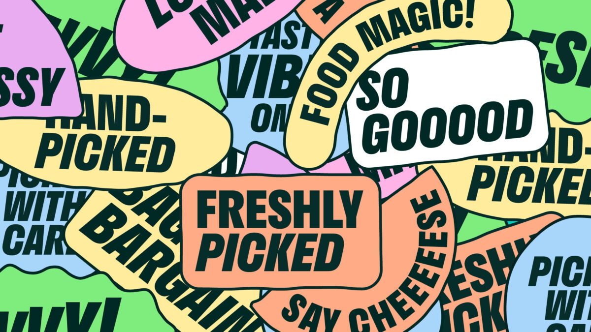
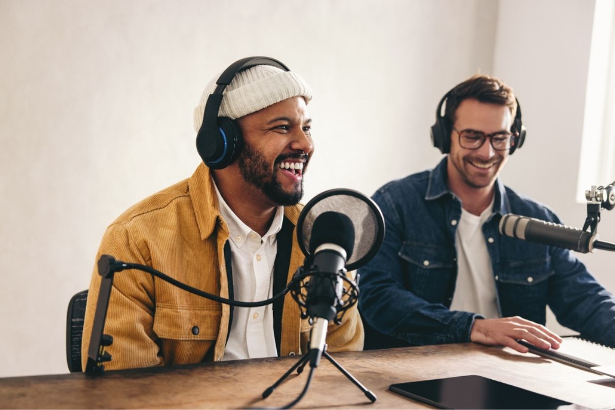
Other distinctive elements that have been created include a set of typographic stickers – imperfect shapes inspired by the eyes in the Roo head – and a nod to the handmade nature of Deliveroo’s customer journey; from chefs who hand-make the food to the rider who hand delivers it.
“Our in-house talent, combined with knowledge of the brand, meant the team were perfectly placed to develop a brand identity – flexible to the needs of the entire global organisation – including our external agency partners,” Deliveroo global director of brand and creative, Emily Somers.
“Eight months may seem like a long time, but it meant we could build something that works for everyone and something all of Deliveroo can be proud of.”
Deliveroo global head of creative Paul Hewitt, added: “This is the real deal. For the first time since 2016, we have a consistent visual foundation for our creative campaigns. Our new work shows how much life is left in our most distinctive brand asset.
“Looking afresh and discovering new elements inspired by the Roo head has been a total joy to direct. Proof that sometimes the answer is staring you right in the face (literally).”
“As a creative team, we are now brand guardians, which gives us a new role in the business. But we’re hungry for more and I’m excited to start to bring this work to life to keep Deliveroo looking smoking hot and tasty – around the world.”
The brand refresh follows a new global platform earlier this year, ‘It’s All On Your Doorstep’, which celebrated the brand’s role at the epicentre of local food scenes around the world.