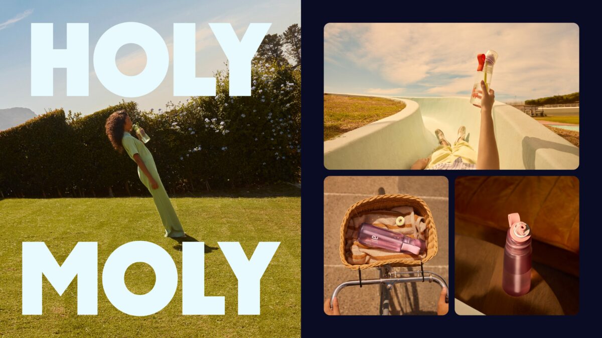
Air Up is unveiling its first rebrand since it launched in 2019, after identifying a need to further position itself as part of an aspirational lifestyle.
Created with Mother Design, Air Up’s new visual identity aims to tap into parents and kids looking to establish healthy habits at an early age, as well as adults looking to maintain a healthy lifestyle without losing out on taste.
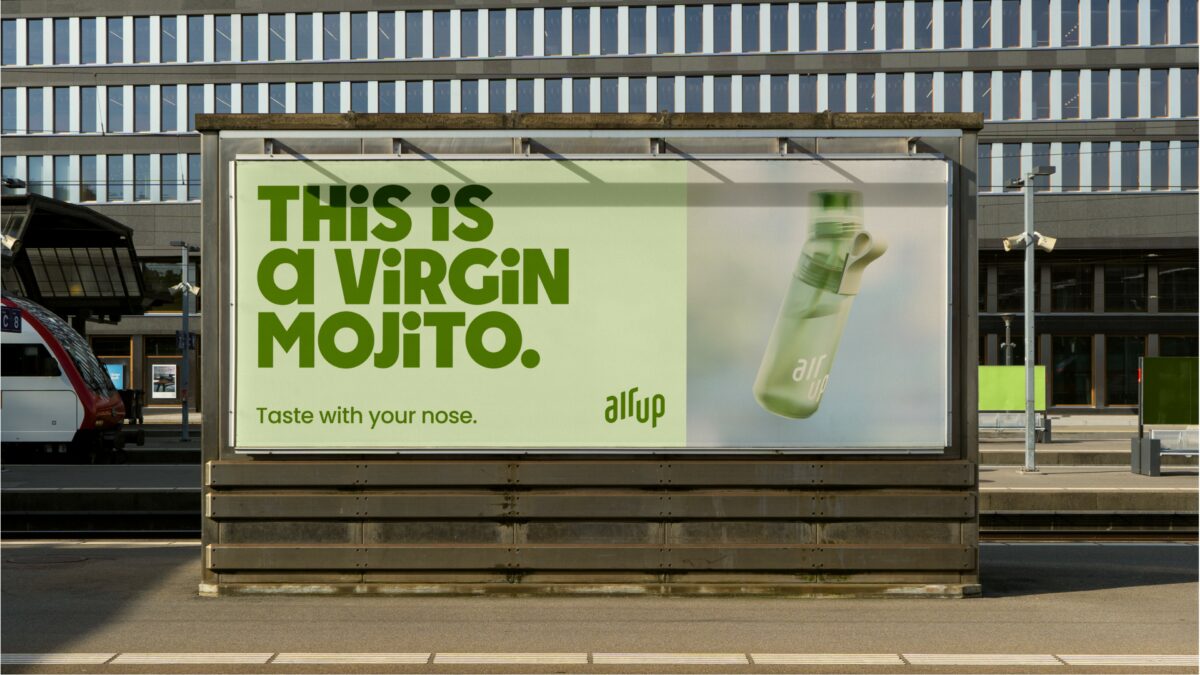
On the new platform, which is set to roll out across print, advertising, products and digital, the existing logo has been refined to increase clarity and improve impact, but retained the familiar symbol.
However, it has embraced a playful custom typeface, and a paired back secondary typeface as a well as a vibrant new colour palette.
“Collaborating with the Mother Design team was absolute bliss. It was an immersive and collaborative experience, very dialogue-driven and at a very high bar. The level of professionalism and expertise throughout the project was impeccable,” said Air Up brand creative director Nima Akbari.
He added: “The design is a marriage between the playfulness of the inner-child in typography and colors, in combination with a very put-together adult-like strictness in the totality of the design system.”
Subscribe to Marketing Beat for free
Sign up here to get the latest marketing news sent straight to your inbox each morning
Further developments included using using 3D design tools like Nomad Sculpt and Spline to work towards a tangible visual language that serve to reflect a totally new experience.
“By blending bold, expressive elements with a touch of whimsy, we’ve created a vibrant and engaging experience that speaks to both sides of our audience,” said Mother Design creative director Harry Edmonds.
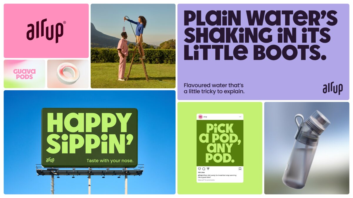
“Harnessing cutting-edge design tools and generative technology, we’ve pushed the boundaries to visually represent the concept of ‘taste experienced through scent’ in a tangible way,” he continued.
Air Up head of global brand strategy Toma Perret added “brand strategies to translate them into tangible and engaging experiences – through solid processes, dialogue and close collaboration. We believe the new identity will be one of the cornerstones of our future successes.”
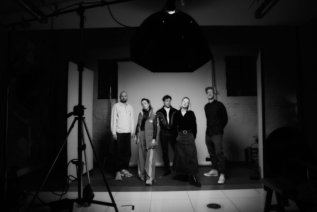
Image credits: Melissa Schriek