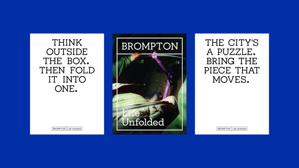
London agency Studio Blackburn has partnered with iconic folding bike brand Brompton to mark its 50th anniversary with a major brand refresh.
The new positioning, Life Unfolded, is inspired by the company’s signature fold-and-unfold mechanism.
Brompton, founded in the UK and celebrated worldwide for its compact design and engineering, has grown into a global brand. However, it’s struggled with juggling its classic identity with growth.
“Our bikes are more than transport. They change how people navigate and experience their cities, and in markets like Asia, they carry huge lifestyle status,” said Dimitri Hon, senior creative at Brompton, “We needed a brand identity that could articulate that breadth of meaning with consistency and energy.”
Subscribe to Marketing Beat for free
Sign up here to get the latest agency-related news sent straight to your inbox each morning
To address this, Studio Blackburn placed motion at the centre of the rebrand. The unfolding transformation of the bike itself has been used as a creative foundation for a broader motion language.
“Brompton is a moving product and it demanded a moving brand,” said Studio Blackburn founder Paul Blackburn, “Our goal was to design an identity that reflects the intelligence and adaptability of the bike itself, while giving Brompton teams around the world the tools to bring it to life.”
A refreshed logo system expands from a simple boxed form into multiple variations, mirroring the bike’s folding action. A bespoke in-house typeface, extended from the original brand typeface, gives consistency across communications.
The toolkit also includes icons, geometric shapes and passport-style stamps drawn from the bike’s components and engineering details, in a nod to the brand’s heritage and community ethos.