London-based coffee brand Dark Arts is celebrating its tenth anniversary with a bold new visual identity and packaging approach. The rebrand was created by NOT Wieden+Kennedy, the design and branding arm of creative agency Wieden+Kennedy London.
The new branding concept, named ‘Joyful Nihilism’, draws inspiration from the company’s original roastery and café signage, which featured playfully dark messages and occult iconography.
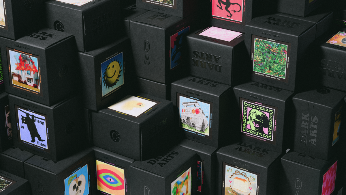
Key elements of the new identity include consistent font usage, updated iconography and a refined colour palette. The company has also introduced a unique approach to its packaging.
Each box of coffee now features a window revealing a collectible card, complete with unique artwork for each coffee variant, tasting notes and information on origin and roasting process.
Subscribe to Marketing Beat for free
Sign up here to get the latest agency-related news sent straight to your inbox each morning
The rebranding effort aims to cement Dark Arts’s position as a lifestyle brand with global potential. NOT Wieden+Kennedy has produced more than 50 initial artwork designs for the launch, setting the stage for Dark Arts to continue creating its own designs and collaborating with other artists and brands in the future.
Justin Hallström, NOT Wieden+Kennedy creative director, said, “The challenge with brands like Dark Arts – who already have a strong personality and loyal fan base – is to make something fresh without losing their personality.
“And at the same time, we needed to balance introducing more consistency whilst being sure to not put a ‘creative straight jacket’ around their eclectic personality.”
Hallström added, “The solution was a simple, refined approach to the visual identity; offset with a sharp tone of voice brings their new brand personality, Joyful Nihilism, to life.
“Combined with the unique approach to packaging with collectible cards, it makes for a perfect canvas to keep the brand fresh and relevant for years to come. We’re so excited to see where Dark Arts takes it from here.”