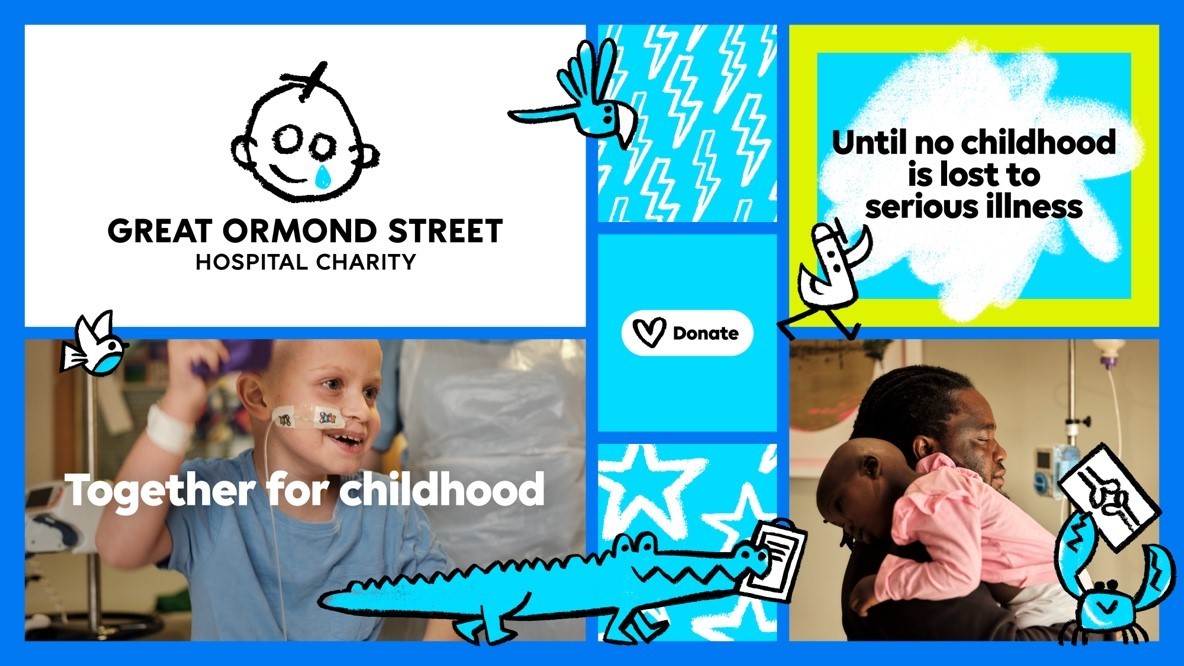
The Great Ormond Street Hospital (GOSH) charity is launching a refreshed brand identity and position in a bid to drive a deeper and more meaningful impact with its campaigns.
The refresh has been actioned by a three-way collaboration between independent creative director Stuart Gough and the brand narrative team at Pentagram, built on a strategy developed by creative agency Impero.
With the motion aspect brought to life by Jones Knowles Ritchie, the GOSH rebrand is centred around four key pillars namely, a new identity, a new tone of voice, a new motion identity and a new campaign.
The charity’s new identity aims primarily to communicate the vital importance of the hospital’s work in helping children affected by serious illnesses find a touch of optimism.
“Our refreshed identity, designed to be more accessible, inclusive and digitally enabled, symbolises the progress we’re driving for seriously ill children and underscores the collective role we all play in realising it,” said GOSH director of marketing and communications, Emma Guise.
“By empowering us to be more relevant, we aim to inspire both our current and new audiences to engage with our cause.”
Subscribe to Marketing Beat for free
Sign up here to get the latest marketing news sent straight to your inbox each morning
“Patient families at GOSH have been central to our decision-making process; their call for boldness and acknowledgment of the harsh realities of serious childhood illness resonated deeply. Furthermore, our unwavering focus on childhood and our pivotal role in protecting every aspect of it guided the essence of our new look and feel,”
The child-centric approach will show how fundraising for the charity will help it conduct crucial research into childhood illnesses and support families at their lowest
Creative director, Stuart Gough added: “We saw an opportunity to create a design system that leveraged the love and character of the original sketch.
“The concept throughout the identity is to embrace the energy of a child’s drawing; the charm and mistakes that this can bring – when harnessed carefully it can make a distinct and positive identity system that is recognisable through its entire personality, not just the logo.”